For SaaS leadership teams who live across too many tools
For SaaS leadership teams who live across too many tools
For SaaS leadership teams who live across too many tools

Problem
Problem
Revenue lives in one tool, retention in another, acquisition in a third. By the time leadership has the full picture, the context has already shifted.
Revenue lives in one tool, retention in another, acquisition in a third. By the time leadership has the full picture, the context has already shifted.
Problem
Revenue lives in one tool, retention in another, acquisition in a third. By the time leadership has the full picture, the context has already shifted.
Approach
Approach
The challenge wasn't visualization, it was grouping. Executives think in questions, not metrics. The dashboard structure follows those questions, not the data schema.
The challenge wasn't visualization, it was grouping. Executives think in questions, not metrics. The dashboard structure follows those questions, not the data schema.
Approach
The challenge wasn't visualization, it was grouping. Executives think in questions, not metrics. The dashboard structure follows those questions, not the data schema.
Revenue Analytics
Revenue Analytics
KPI tiles stay fixed at the top so leadership always has the headline numbers in view. The chart below is the only thing that changes when you switch metrics, keeping the context stable while the data shifts.
KPI tiles stay fixed at the top so leadership always has the headline numbers in view. The chart below is the only thing that changes when you switch metrics, keeping the context stable while the data shifts.
KPI tiles stay fixed at the top so leadership always has the headline numbers in view. The chart below is the only thing that changes when you switch metrics, keeping the context stable while the data shifts.
Customers Analytics
Customers Analytics
Churn and growth sit on the same screen deliberately. Seeing them together forces the question the dashboard is designed to answer: are we acquiring faster than we're losing?
Churn and growth sit on the same screen deliberately. Seeing them together forces the question the dashboard is designed to answer: are we acquiring faster than we're losing?
Churn and growth sit on the same screen deliberately. Seeing them together forces the question the dashboard is designed to answer: are we acquiring faster than we're losing?
Retention & Cohort Analysis
Retention & Cohort Analysis
Churn rate alone doesn't tell you enough. The cohort view was added so teams can see whether retention is improving over time, not just what it is today.
Churn rate alone doesn't tell you enough. The cohort view was added so teams can see whether retention is improving over time, not just what it is today.
Churn rate alone doesn't tell you enough. The cohort view was added so teams can see whether retention is improving over time, not just what it is today.
Acquisition & Funnel Insights
Acquisition & Funnel Insights
CAC, conversion rate, and sales cycle length are shown together because they answer the same question: where is growth slowing down and why.
CAC, conversion rate, and sales cycle length are shown together because they answer the same question: where is growth slowing down and why.
CAC, conversion rate, and sales cycle length are shown together because they answer the same question: where is growth slowing down and why.
Design Language
Design Language

Labels stay small and muted so the number dominates at a glance.
Labels stay small and muted so the number dominates at a glance.
Labels stay small and muted so the number dominates at a glance.
Opacity encodes retention percentage so drop-off patterns are visible without reading every cell.
Opacity encodes retention percentage so drop-off patterns are visible without reading every cell.
Opacity encodes retention percentage so drop-off patterns are visible without reading every cell.
Single hue with no legend. Color carries no categorical meaning here, only the number does.
Single hue with no legend. Color carries no categorical meaning here, only the number does.
Single hue with no legend. Color carries no categorical meaning here, only the number does.
A consistent set of decisions across color, type, and component structure keeps the interface readable at high data density.
A consistent set of decisions across color, type, and component structure keeps the interface readable at high data density.
A consistent set of decisions across color, type, and component structure keeps the interface readable at high data density.
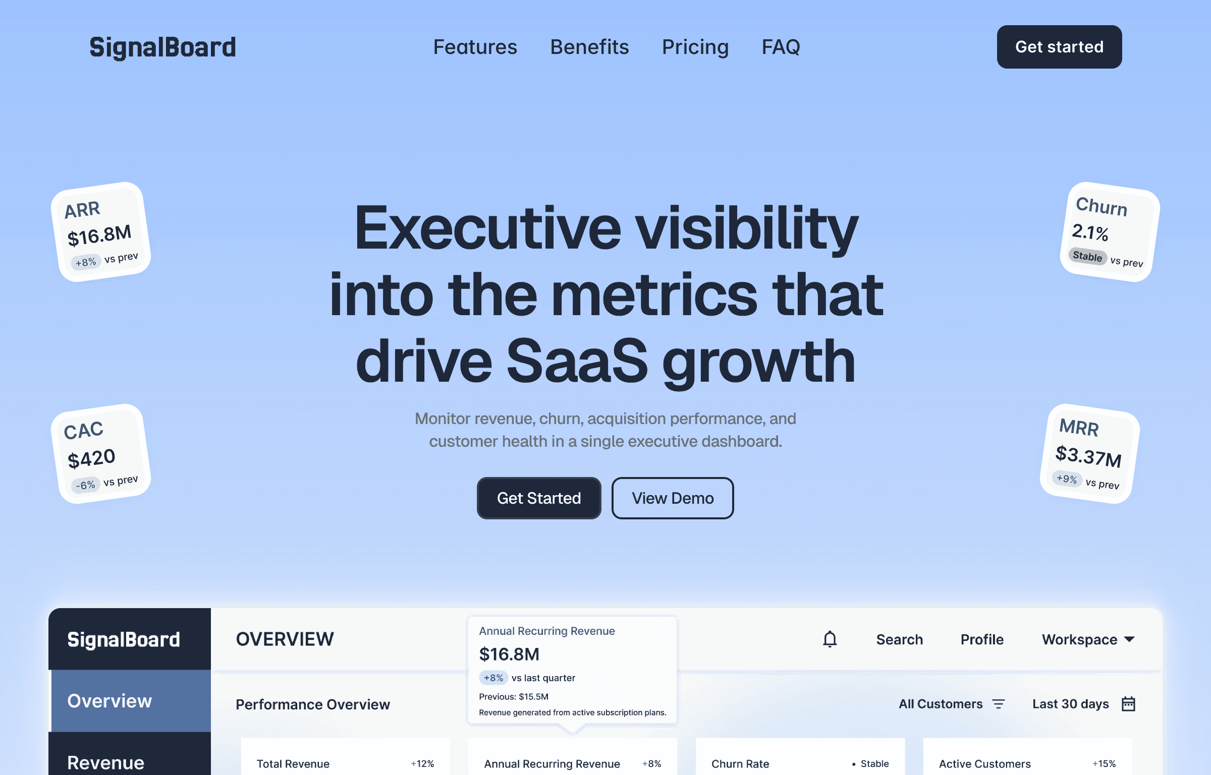
To position SignalBoard as a SaaS analytics product, I also designed a full marketing landing page.
To position SignalBoard as a SaaS analytics product, I also designed a full marketing landing page.
To position SignalBoard as a SaaS analytics product, I also designed a full marketing landing page.
View Landing Page
View Landing Page
Impact
Impact
Faster Decisions
Faster Decisions
Leadership gets the full picture in one view instead of waiting for someone to compile a report.
Leadership gets the full picture in one view instead of waiting for someone to compile a report.
Less Context Switching
Less Context Switching
Revenue, retention, and acquisition data in one place means fewer tabs, fewer exports, fewer handoffs.
Revenue, retention, and acquisition data in one place means fewer tabs, fewer exports, fewer handoffs.
Earlier Risk Visibility
Earlier Risk Visibility
Churn and revenue exposure sit on the same screen, so at-risk accounts surface before they become lost accounts.
Churn and revenue exposure sit on the same screen, so at-risk accounts surface before they become lost accounts.
